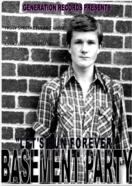
My magazine advertisement has changed a lot compared to the draft I created, when I first began to plan how I wanted the advertisement to appear. Orginally, I wanted to use a shot which is featured at the end of the music video - this shot displayed the entire band, whilst they walked down the streets of London. However, I decided to change this image to a picture of the lead singer stood in front of a brick wall. Images of brick walls are featured in the music video, therefore using this image created brand idenity. The bricks also suggest that the singer is urban and streetwise. He looks, in this image, confident and cool, he also looks isolated from the band suggesting that he is an outsider. The black and white effect added to the poster makes the lead singer appear sombre, melancholy and dark. The photograph is slightly out of focus which suggests it is from the past however the checkered shirt is a badge of indie fashion. This modern dress and makes it clear he is from this time and place.
The font and style of writing I used for the poster is similar to the writing used on the Digi pack; I was aiming for something which suggested an alternative edge, for example the record company label has a retro feel and could be something that you could have seen in the '80s or '90s. "Generation Records Presents" is outlined in purple and draws the eye in as it's the only colour used. The text underneath is bolder,bigger and more modern which creates a statement and highlights the band's name suggesting they are a group to watch out for. The font is aggressive because of its size, therefore projecting teenage 'in yer face' anger. The darkness of the font echoes the mood of the band and their music.The name of the song is in smaller font above the band's name and is similarly reflected in white below. This upside down reflection has a disorientating effect, again lending a more modern edge to the band.
The aggressive type face and urban wall is balanced out with the ordinariness of the lead singer's appearance.
The poster features quotations from well known, reputable music magazines such as 'NME' and 'Kerrang'. Because of the music these magazines are associated with it lends the band authenticity, and the postitive reviews will help to increase sales and convince the public of their talent.

No comments:
Post a Comment